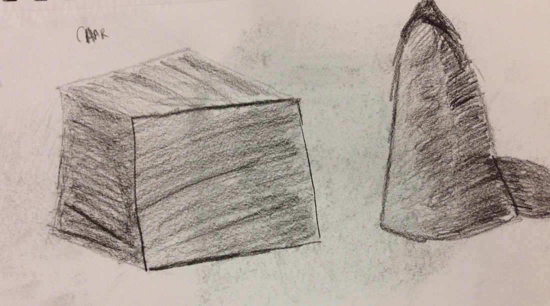
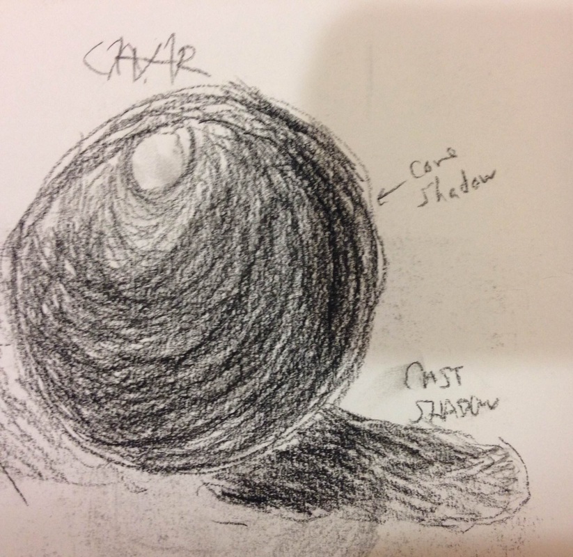
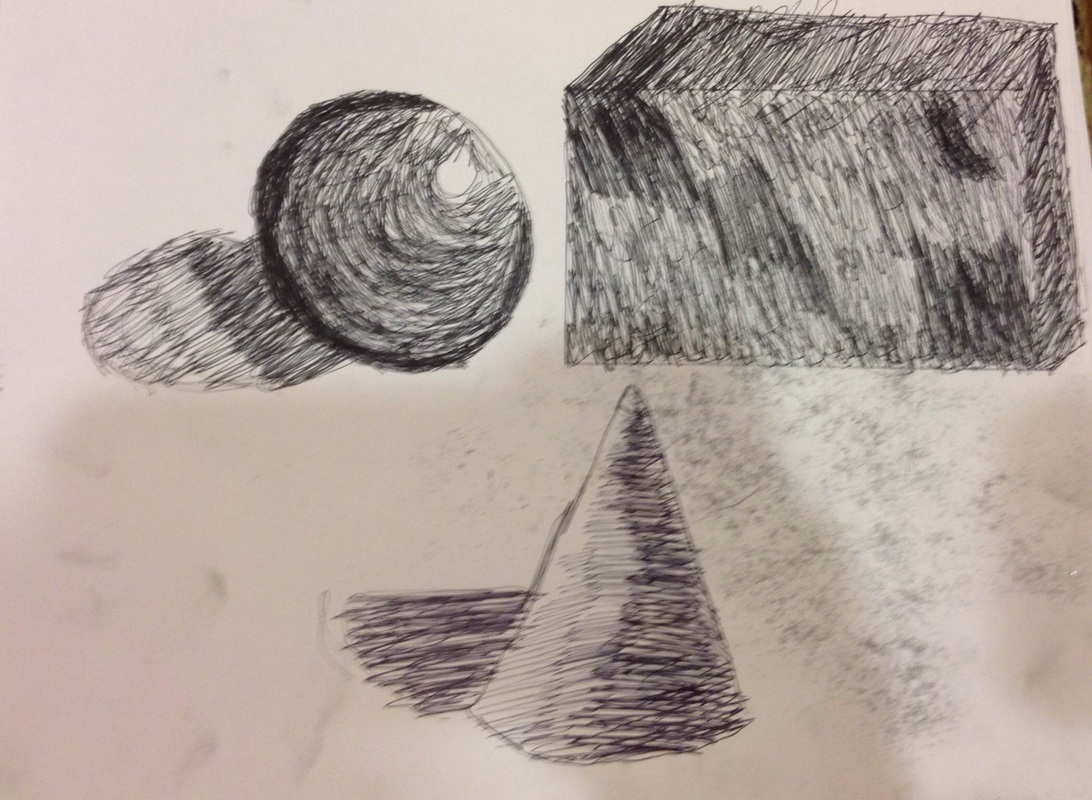
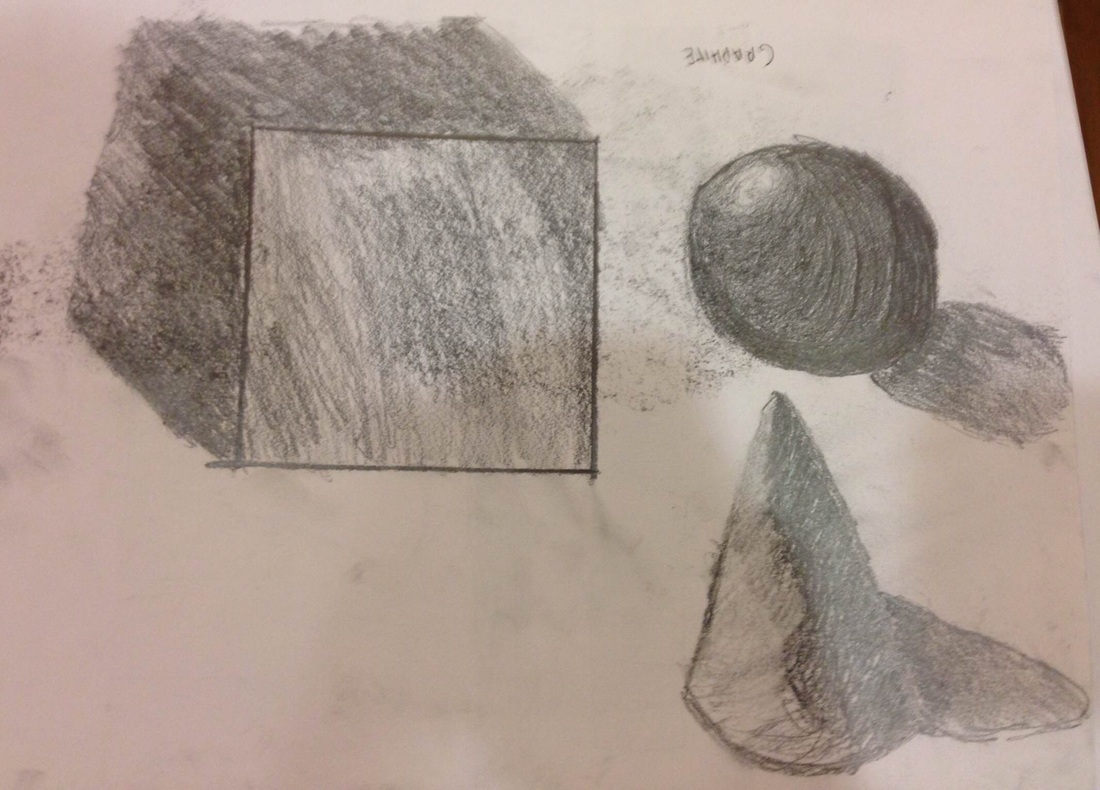
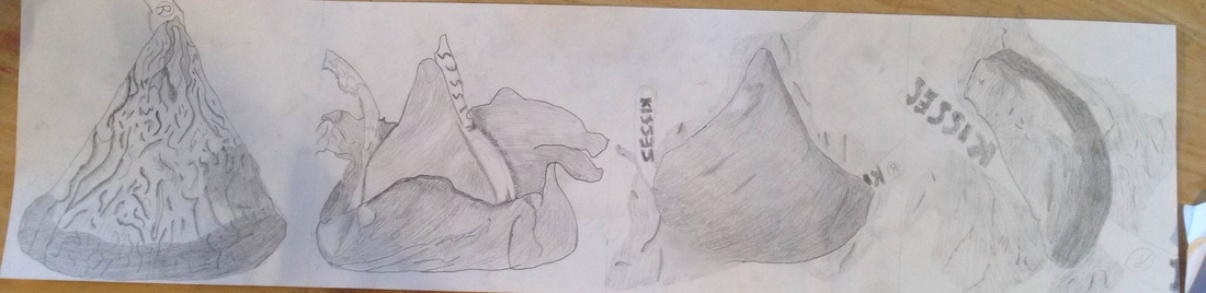
For this assignment, I had to draw three different three dimensional shapes in three different mediums. I drew a cube, cone, and sphere with pen, graphite, and charcoal. My least favorite medium to use for this assignment was pen because i felt it turned out the worst of the three mediums. It was also the most tedious and demanding of the three mediums. My favorite medium for this assignment is a tie between charcoal and graphite. They both were very easy to use to express and portray three dimensional shapes. They both were easy to transition between different values unlike the pen which essentially kept one constant shade but the shade was determined by the number of pen strokes. I learned that with a brightness there is usually a shadow that is next to it but fades/transitions from shadow to brightness. The shadow that the object cast is called the cast shadow (sphere). The shadow that is within the actual object and adjacent to the cast shadow is the core shadow(sphere). Opposite of the cast shadow is a highlight signifying light shining on the object. In my opinion, the cone was the most difficult of the shapes to draw. I think because it was the shape i was least familiar with drawing.
|
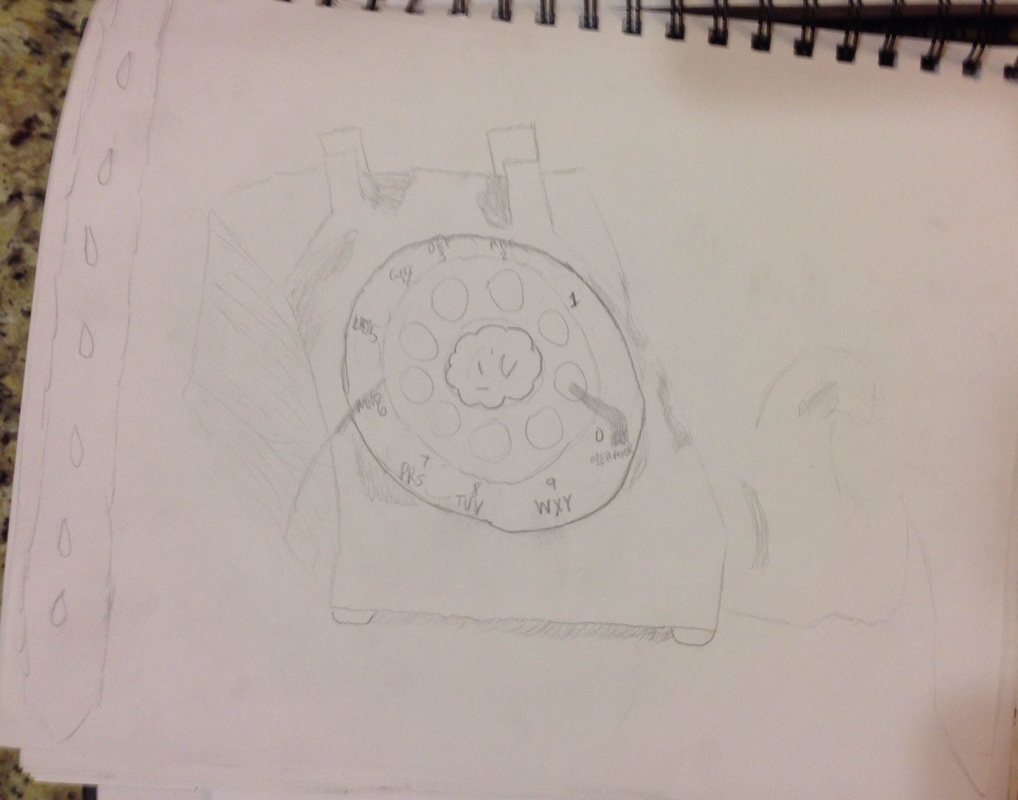
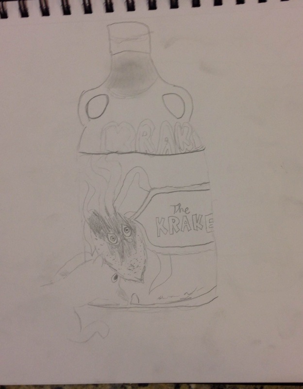
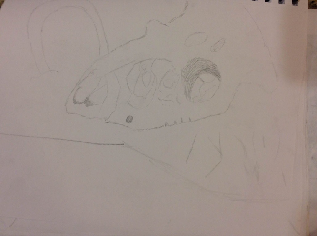
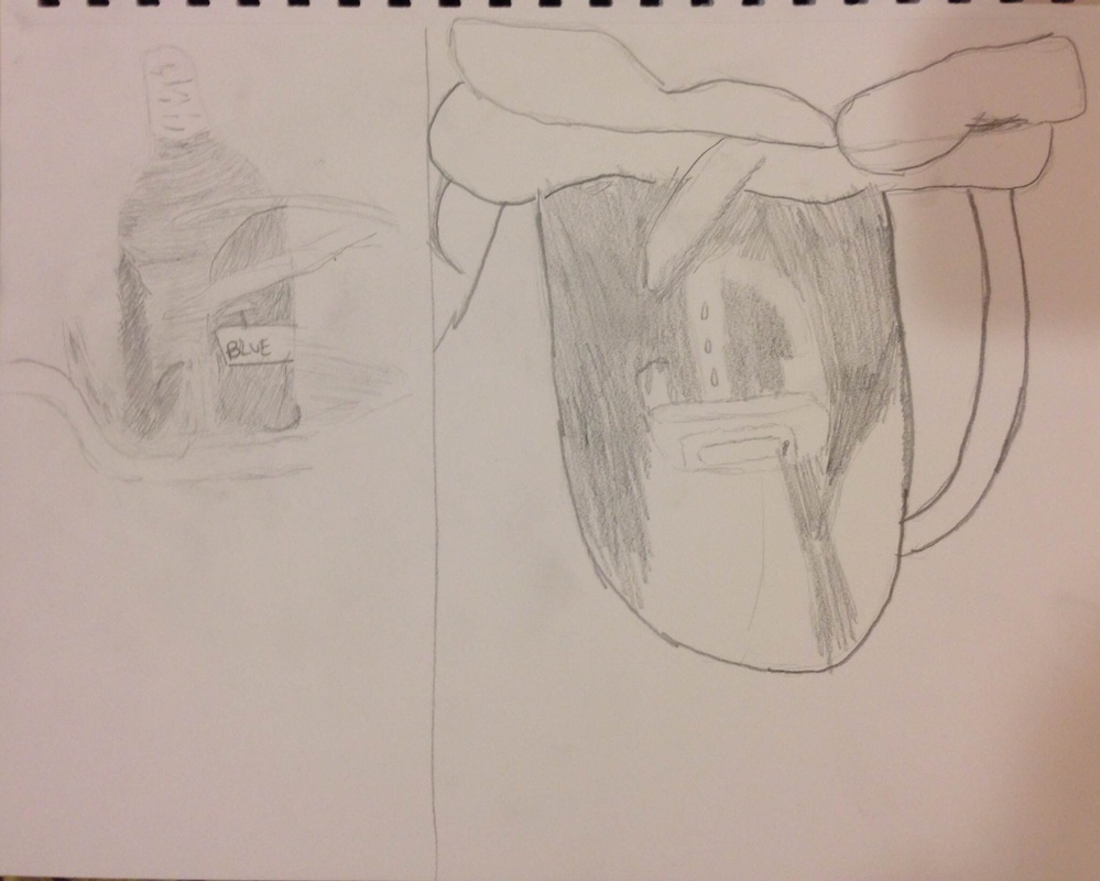
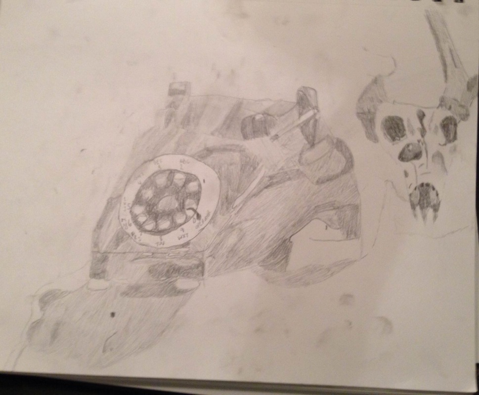
These are the six still lifes that i did in class today. The first is a old phone. I felt this one came out well. I felt it was the least difficult to draw as it was simply angled lines and circles with some shading. I also drew the saddle belt next to the phone. The next was a jug/bottle with the label "The Kraken". My favorite part of this still life was drawing the kraken. For the head of the kraken i did progressive shading from dark to light. For the glass imprint that says "Kraken" i drew a dark outline of the words in bubble font followed by in the inside with a light outline saying "Kraken". The skull was without a doubt the most difficult out of the five still lifes that i drew. It was difficult to draw the depth of the eye and crevices of the skull. The general outline of the skull was not difficult. I did the skull zoomed in with my viewfinder in order to add more detail to the skull instead of its surroundings. However, by the skull you will see a horse shoe. I also drew another jug/bottle. In this still life, I drew with a lot of shading to add detail. I made a point of adding the leaves that interfered with the overall picture of the bottle/jug. I drew the horse shoe by the jug so that the jug was not singled out. I felt showing different values in shading helped contribute to the curves of the jug. For my fifth still life, I drew a saddle. the saddle was not too difficult. The basic outline was not difficult. There wasn't much shading to do. I drew this in moderate detail. I felt i could have shaded more on the top/seat of the saddle to show an arc like portray of the seat to signify its curves. For my final still life, I drew the old phone, skull, and some of the fabric surrounding the two objects. I felt this one came out the best. It was much easier than the others because I took a picture of what i wanted to draw and changed the filter of the image to black and white which made it easier to determine and draw values of the picture. I feel there is a wide range of values in both. I felt the skull came out better than my first attempt at the skull and so did the phone. There is darkness and highlights evident in both objects. There is shading drawn in different directions to distinguish the different angles evident. As i finished my final still life, i felt that i vastly improved.
 For this assignment I drew four phases of a Hershey's Kiss. Phase one was with the aluminum wrapper on. I learned with this phase that too much detail can be a bad thing. I felt showing too many crinkles in the wrapper made it less appealing. For phase two, I drew it slightly unwrapped. I felt this one turned out very well. You can see the wrapper peeled off slightly and the Hershey kiss is still there. i showed a wide range of values to contribute to the different aspects of this piece. I wanted the shading to go in one general direction for the most part (I felt this would help differentiate between wrapper and candy). For phase three, I drew the candy with the wrapper entirely off but beneath it. It was a struggle to portray the wrapper beneath the candy but i felt i got it done. There were parts of the candy where the light hit it differently showing darkness compared to brightness in other areas of the candy. This aided in the overall shape (curves) and movement of the piece. I felt phase three turned out very well. For phase four, I ate half of the Hershey kiss and the wrapper was beneath the candy. You can see light bite marks and the wrapper and paper beneath the candy. I showed a wide range of values in order to show height difference from the wrapper to the paper label to the top of the candy. The darker it is(the candy top)= the higher it is. The lighter it is= the lower it is.
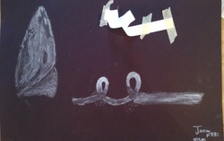 For this assignment I drew a ribbon. We taped down a piece of paper and curled it. We then drew from an observational standpoint and made sure to include the folds and swirls of the ribbon. I tried to make my strokes and shading with the charcoal flow with the way the ribbon was going. I made a point of value contrast with the ribbon's loops to show depth. By doing so, it gives my drawing the effect that the ribbon folds over on itself during the loop. 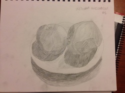 For this assignment, I arranged a still life. The still life was of a plate with an apple and orange on the plate. I incorporated different values to add detail when it came to shading my assignment. I felt the fruit came out well. However, in the future i will know to add more detail to the plate beneath the fruit.
For this assignment, I drew a Venus Fly Trap. I thought it would be fun to draw a Venus Fly Trap because of its uniqueness among other plants. I drew this plant with a lot of detail. I utilized line contour and line variation in the leaf, root, and teeth of the plant. I also made a point of shading the plant. I had trouble incorporating line contour and line variation but managed to do so.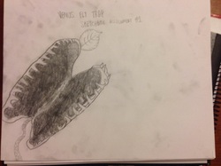
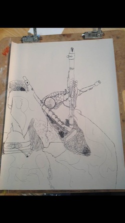 This is my band instrument contour drawing. I did this drawing from an observational standpoint and was allowed to view my paper whenever i wanted to. I added as much detail as possible. I liked this assignment because of all the unique lines that i drew based off the instruments and fabric beneath. I felt that my instruments turned out well. They show a lot of detail. Contour was a bit of a challenge as it required me to do this without lifting my pen. I regret using scribbles to make shadows of the fabric and instruments that clashed and made the fabric fold on itself. It came across as being poorly done instead of creative when i added the scribbles as shadows. The folds of the fabric in contour was also quite difficult to portray because of the fact that it had to be one continuous line. Overall with it being a contour drawing, I thought it turned out well.
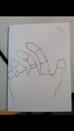 This was my first modified contour of my hand. My second can be seen in previous blog posts. My second shows my improvements as this was my first time doing modified contour. I felt i managed to draw a general outline of my hand and drew the wrinkles in the fingers but struggled with adding more detail without lifting my pen. I later learned how to fix this by not drawing the general picture first and then the detail but instead drawing each section at a time with as much attention to detail as possible as shown in my second Modified Contour Drawing. 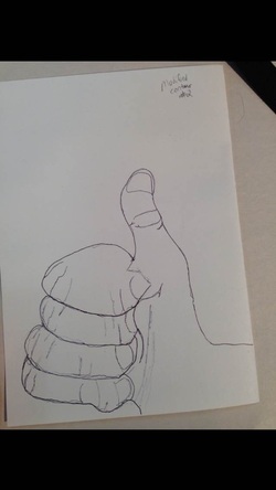 For this assignment, I drew my hand in a thumbs up pose in Modified Contour. Modified Contour is when you draw but make a point of looking at the edges of the object, while barely looking at the paper while using the pencil. I felt I did well because it ended up turning out good. I felt that there is a 3-D aspect to this piece. The wrinkles and creases in the hand show edges, detail, and support my belief of it being in 3-D. Due to the curve of the index finger it aids to making it look more 3-D and curve into the palm of the hand. The wrinkles also add curves to the fingers. I felt the fingers were all the same size/length making them disproportionate and unrealistic. I also think that you only see one part of the index finger. I struggled with drawing the finger nails.
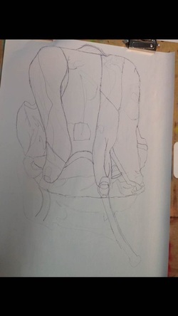 For this assignment, we drew a Contour Line Drawing. A Contour Line Drawing is a line drawing done with smooth, even, and continuous looking lines. These drawings describe the interior and exterior linear qualities of a subject. I drew my backpack. I felt I did a good job on this. This was done without lifting my pen and I was still able to manage to have detail in this piece. Did you gain skill with familiar materials? I think the hardest part was drawing the creases of the backpack because it required patience and a lot of skill. However i was able to draw the creases of my backpack. Did you consider how ideas would work before you tried them? I debated if i should do some form of cross hatching for the netting of the backpack but felt that would possibly contradict Contour Drawing. Did you try something that you weren’t sure about as part of this project? I was taking a risk on this assignment because I was vaguely familiar with Contour drawing from sophomore year (currently a Senior). |
AuthorWrite something about yourself. No need to be fancy, just an overview. Archives
May 2015
Categories |
 RSS Feed
