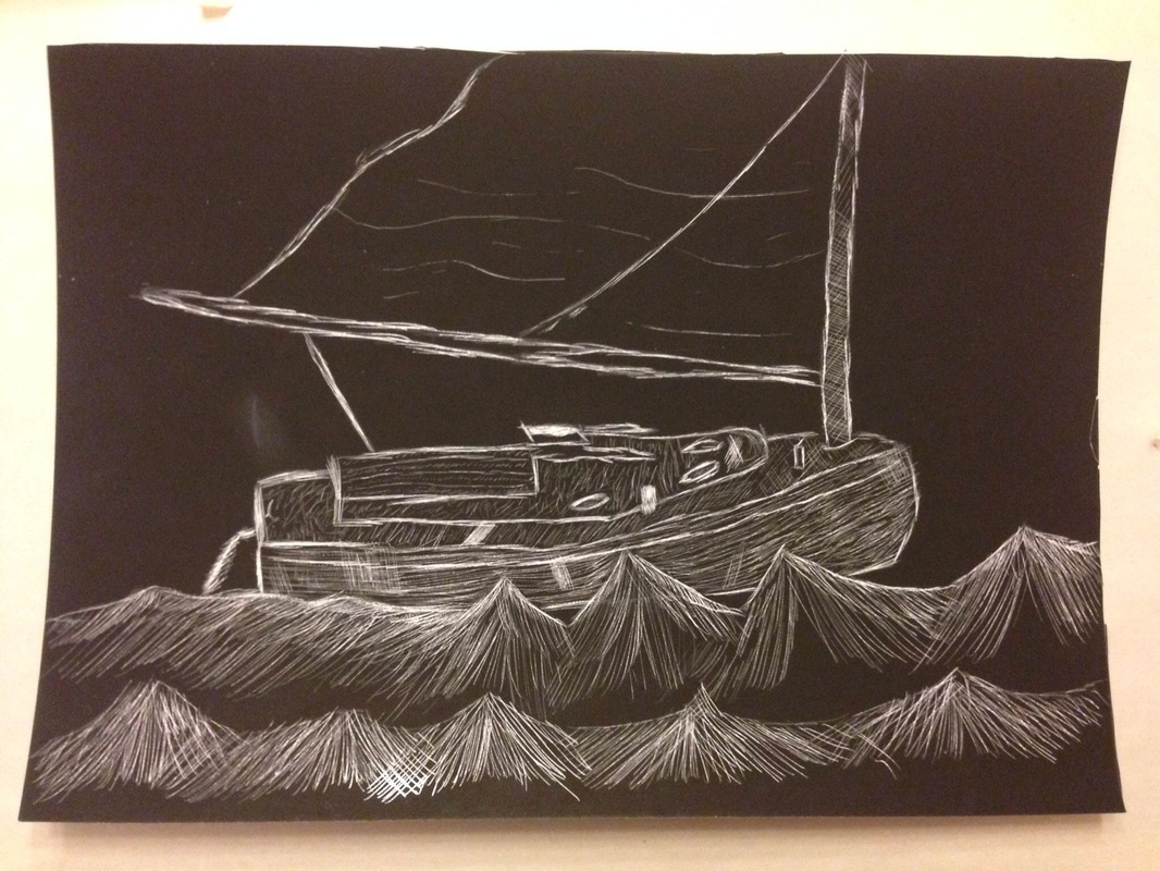
For this assignment, I drew a sailboat on a scratchboard. Scratchboard is a black cardboard that when scraped reveals silver or white. I chose to use the scratchboard that reveals white. I chose white because I thought it would be best in capturing the highlights of the sailboat. Once I came up with an idea, I then sketched it onto the scratchboard using a white prismacolor. I then began to scrape the general outline of the boat. After that, I started making waves. For me, waves were the strangest thing to do in this entire process. It just felt weird with how waves are drawn and applying that to the scratchboard. I utilized techniques that i have learned earlier this semester such as cross hatching as seen on the mast of the sailboat. The movement of this piece can be shown in the waves and the sail is flowing and fluttering in the wind. The sailboat is also going through the water. I wanted to draw detail into the side of the boat that i thought would compliment the movement of the boat going towards the right of the paper. I did this by showing wear and detail to the side of the boat (from left to right). I added lines in the sail to show that the sail was fluttering in the air. Finding values in this was difficult because scratchboard is a new style of art for me. I was not familiar with scratchboard until starting this assignment. However, after completing this assignment, I feel much more comfortable about doing scratchboard.
For this assignment, I drew a self portrait. However, I distorted my appearance on one side of it. On the left side, I am a werewolf. On the right side, I am myself. The medium that I used was graphite pencils. Drawing the fur and background took time with graphite pencils as it was individual pencil strokes making it a very tedious and cumbersome process. I feel that the background would have been better if I had made it darker. It would have made the outline of my face, neck, shoulders, and the moon all "pop" because it would have shown a more clear contrast. I think that the ears came out really well. My drawings of the eyes also look good with the exception that one is slightly larger than the other in this piece. I feel that I could have worked more on the teeth because the teeth could have been receding using one of the perspective techniques as this would have added depth and dimension to the teeth and mouth. Overall, I think that this assignment came out well. I feel that I have grown as an artist as this semester has gone by. This is my final for the opacity assignment. I drew a glass coke bottle with prismacolors inside. The medium I used was prismacolors. I liked working with prismacolors because they blend very well. It was challenging to produce an opaque glass bottle that had a greenish hue because the greenish hue took a long time to finally and successfully attain. I think that my lettering has improved. Along with noticing colors and different values. I noticed I was able to successfully obscure the prismacolors in the glass bottle because the glass bottle obscures objects inside and behind it (an example of behind is the meter stick shown slightly in the bottle). I drew a wooden table under the bottle by using one point perspective. Did you pick a material or technique that was new or different over something that was familiar? Did you learn new techniques or processes as part of the work for this project? I took risks with this assignment. I was fairly unfamiliar with how to blend prismacolors. However, Mrs. Rossi was extremely helpful in teaching our class how to properly blend colors so that these blends came out "cleanly". It was a risk when I had to draw a greenish hue to the old glass coke bottle. To this i mixed several colors like green, white, black, yellow to different degrees in order to show a wide range of values. After this assignment, I had become familiar with and started to develop blending with prismacolors in a more comfortable sense. Did your work take an unexpected turn due to a mistake or did something happen that was unplanned? Although I made a mistake, I was able to capitalize on that mistake. If you look at the blue colored pencil inside the bottle, you will see that it is slightly warped by accident. This actually was beneficial to my piece because it made the glass distort what was inside and behind it (this is what glass should do, when looking through it). The egg was my least favorite assignment so far. It was difficult and awkward for me to draw in a crescent motion that went with the egg. I think there is a wide range of values present. The highlight came out well in contrast with the rest of the egg. The green in the background is made up of vertical lines blended in (grass-like).
I think the smarties candy came out well. I wish i could have produced vibrant colors. These pastels were messy but i enjoyed using them. I think the wrapper came out really well. The white streaks are the light reflecting the wrapper. The logo also came out well in my opinion. The medium i used was chalk pastel. I felt the lollipop came out well. I managed to get the general shape. I blended several colors throughout the process especially during the saturated wrapper and lettering. I noticed two shadows when drawing the lollipop. I felt with prismacolor's it was a rather tedious process. Constantly experimenting with mixing colors was tedious and cumbersome but i eventually managed to produce the colors i wanted. I think the folds of the wrapper needed work. The values of the stick could have also used some more work. For this assignment, I drew three objects that seem to have no relation to each other. I used only one graphite pencil. To get the shading, I used several different angles of the pencil to make certain areas either darker or lighter. I made a point of showing contrast by having highlights and areas of dark. I had my pencil strokes go in several different directions. This was to show dimension (ex. the pencil sharpener bottom). My favorite parts to draw/the parts i felt came out best were the pencil sharpener mechanical interior and the baseball. I think i could have used more detail on the candle. Overall, I think it came out well. For this assignment, I drew a perspective drawing. i used one point perspective. This is one point perspective because there is one single vanishing point. My vanishing point is on the horizon line. i felt one point perspective was the best option for drawing attention to the distance of objects. My sidewalk lines all go to the vanishing point. This shows distance. The objects like the bicycles, trash cans, etc. all become smaller as they get closer to the vanishing point. I felt i did well on the overall perspective portion of this project. I struggled with shading and distinguishing different values. All of the lines drawn somehow lead to the vanishing point or are affected by it. I developed my art skills through this assignment when it came to distinguishing values and creating a wide variety of values. Did you try something that you weren’t sure about as part of this project? Did you pick a material or technique that was new or different over something that was familiar? At first I was taking a risk when it came to this assignment because I struggled with drawing and distinguishing different values. How did you respond to challenges that occurred as you worked? I was able to take the picture that I was drawing based off of and added a black and white filter which allowed me to see the values. I then drew what I saw. Did you ask another student for feedback during your work process? Throughout this assignment, I made a guideline of what i wanted to accomplish each day. Throughout the course of a day or two, I would consult with my peers and ask for their thoughts and opinions on my assigment. Their compliments and criticism were extremely helpful in the success of this piece. For this assignment, I drew a bottle and can. The medium i used was several graphite pencils. I feel graphite pencils are a good medium that i am comfortable with. I felt that the can came out better than the bottle. I think the reason being because of the amount of detail in the can. The can having been crunched up showed lots of detail which contrasted with the bottles' smoothness. I felt that the bottle had several values whereas the glass had very few. Drawing the can was like drawing a puzzle in a way with its fragmented and crunched pieces. The can shows detail, texture, and value. Whereas, the bottle really shows detail and value. The can was not difficult to draw. Whereas, the bottle was difficult. I am not familiar with drawing glass or value in glass. I did remember how to draw glass imprint, which you do by drawing a light outline followed by a dark outline of letters or a symbol. I drew letters in that way. I watched a few tutorials on drawing glass but still think i could practice on that. For this homework assignment, I had to draw dishes in a drainer. I do not own a drainer. Instead, I drew the bottom rack of my dishwasher. There were a few dishes on the bottom rack. I used several values to distinguish plates, bowls, pans, silverware, and shadows. For myself, this assignment was very difficult. I think it was difficult because I had to draw several different things all clustered together, show value, and remember to draw the dishwasher rack. For myself, it seemed that it was difficult to distinguish between the dishes even with values. I think that in the future that perspective could aid me in showing the depth and length of the dishwasher rack and helping to distinguish the dishes among one another. I knew that it was essential to show the shape and texture of the dishes by shading in different directions and felt I did so. For this assignment, I drew a still life of objects brought in by classmates. The medium used was graphite pencils. For this assignment, I practiced drawing several objects that were set up in one central location in the classroom. After feeling comfortable having practiced drawing still lives, I then proceeded to choose a group of objects at a certain angle. The old phone and skull both drew my attention. They both relate to the past, one being obsolete to today's technology and the other being a skull to something that once lived. I had practiced with the old phone in my previous attempts and found that i had been really successful with drawing the old phone. The old phone had a wide range of values which really contributed to the overall detail of itself. I decided to do the skull because it drew my attention and also seemed like a challenge with its curves, values, and depth. The skull certainly took the longest. At first I tried drawing my still life which included the old phone, skull, saddle, horse shoe, and drapery in black and white based off of color. I found this to be rather difficult in distinguishing the wide variety of values. I then decided to take a picture of the desired angle and then converted the picture to black and white, making the values far more distinguishable. The most difficult of the objects to distinguish values was of the saddle which seemed as if it were one entire value but with closer examination it was not. The easiest of the objects to distinguish value was the horse shoe because it was essentially two values and a simple shape to draw so long as i added some depth and dimension into making it look three dimensional which I felt i did. I felt that drawing the drapery was the most difficult because i did not want it to blend with the rest of the picture and had trouble drawing the folds and wrinkles. I think that I should practice on the drapery. I felt that this was my best assignment yet. |
AuthorWrite something about yourself. No need to be fancy, just an overview. Archives
May 2015
Categories |