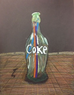
This is my final for the opacity assignment. I drew a glass coke bottle with prismacolors inside. The medium I used was prismacolors. I liked working with prismacolors because they blend very well. It was challenging to produce an opaque glass bottle that had a greenish hue because the greenish hue took a long time to finally and successfully attain. I think that my lettering has improved. Along with noticing colors and different values. I noticed I was able to successfully obscure the prismacolors in the glass bottle because the glass bottle obscures objects inside and behind it (an example of behind is the meter stick shown slightly in the bottle). I drew a wooden table under the bottle by using one point perspective.
Did you pick a material or technique that was new or different over something that was familiar? Did you learn new techniques or processes as part of the work for this project?
I took risks with this assignment. I was fairly unfamiliar with how to blend prismacolors. However, Mrs. Rossi was extremely helpful in teaching our class how to properly blend colors so that these blends came out "cleanly". It was a risk when I had to draw a greenish hue to the old glass coke bottle. To this i mixed several colors like green, white, black, yellow to different degrees in order to show a wide range of values. After this assignment, I had become familiar with and started to develop blending with prismacolors in a more comfortable sense.
Did your work take an unexpected turn due to a mistake or did something happen that was unplanned?
Although I made a mistake, I was able to capitalize on that mistake. If you look at the blue colored pencil inside the bottle, you will see that it is slightly warped by accident. This actually was beneficial to my piece because it made the glass distort what was inside and behind it (this is what glass should do, when looking through it).
 RSS Feed
